Blue Billywig’s Channels feature offers customizable templates to create Netflix-like video experiences, seamlessly integrating into websites and apps. Features include customizable thumbnails, video detail pages, and search functionality to enhance engagement.
Channels are intuitive, responsive, and easy to brand, allowing users to organize and monetize content effectively while analyzing performance to optimize viewer engagement.
Live:
“NEC Nijmegen: Explore NEC TV Channels”
Links:
What is Channels?
New innovations for channels.
Channels just got even better.
Role
Facilitate brainstorming sessions. User research, wireframing, prototype, mentored junior designer.
Methods
Design thinking, usability testing, interviews, wireframes, crazy 8, agile, scrum.
Team
Stakeholders, product owners, product manager, front-end developers, back-end developers, designers.
The Channels feature wasn’t meeting customer expectations, so we decided to overhaul it. While the Channels recently received updates, the Channel editor in the OVP is still outdated.
Our goal was to update this editor to be completely self-service, enabling non-technical customers to manage their own Channels easily.
Our goals
The original Channel editor was too technical, requiring trial and error for customers to achieve their desired setup.
We simplified the creation process, making it more accessible by reducing complexity and hiding advanced options behind toggles to prevent configuration conflicts.
Previously, customizing a Channel’s appearance required CSS skills, which many customers lacked.
We made it possible to easily adjust font families, sizes, and colors directly from the editor, allowing customers to effortlessly align their Channel’s design with their brand.


We chose for design thinking method due to its emphasis on user-centric innovation, providing a structured approach to problem-solving while encouraging creativity and empathy.
Our process
Understand the users’ needs and perspectives:
Clearly define the problem or challenge to be addressed:
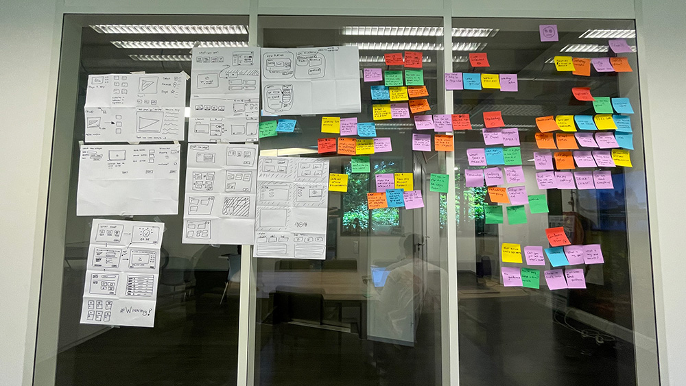
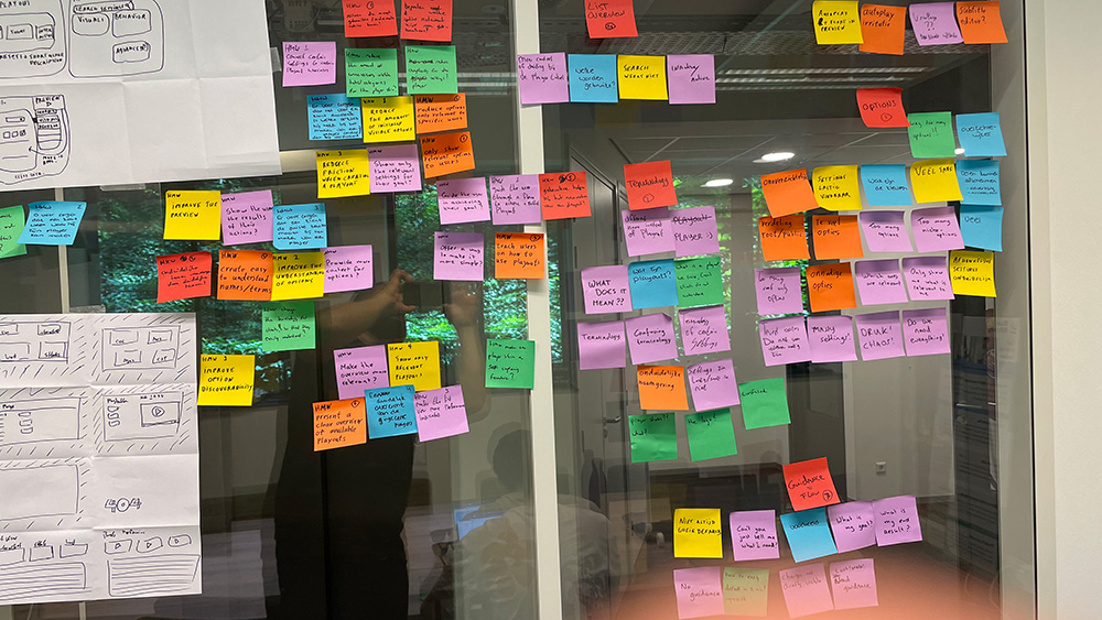
Generate a wide range of potential solutions through brainstorming:
Make specific representations of the proposed solutions.
Gather feedback by testing the prototypes with users.
Refine and improve the solutions based on user feedback, repeating the process as needed.
Based on user feedback, we refined the prototype to address their suggestions. For instance, we enhanced the editor by adding options for different font styles, integrating a comprehensive search function for videos, introducing a detailed view screen for each video, and expanding banner customization options.
Link:
Channels just got even better.


Before diving into Figma, I visualized some concepts using wireframes. This helped me outline ideas and structure before getting into the detailed design work.
Wireframing provided a simplified blueprint, easing the transition to the more refined stages in Figma where I fleshed out the designs with greater detail and interactivity.
Considerations during wireframe development:
Detailed wireframes for discussions with the dev team.
After visualizing the wireframes, we achieved:


It was challenging to offer the builder effectively to the customer. The number of options remains manageable, and what started as a feature with fewer components has shown great potential. We have since added more styling options to provide customers with a unique experience, while keeping it controllable for our platform.
If more features are added in the future, it might be worthwhile to consider creating a ‘builder’ environment where users can select, drag, and drop elements on a canvas, similar to Wix or Elementor.