
Content protection means making sure that your videos or live streams are only seen by the people you want to see them.
This could mean keeping them away from certain parts of the world, specific websites, or people who haven’t paid to watch. It’s like putting a lock on your content to keep it safe and under your control.
Role
User research, brainstorm sessions, wireframing, prototype.
Methods
Design thinking, user interviews, A/B testing, wireframes, Agile, scrum.
Team
Stakeholders, Product owners, Product manager, front-end developers, back-end developers, designers.
Our challenge was to keep our clients’ media clips/live streams/channels private, allowing access only to authorized viewers due to rights, sensitive content, or subscription rules.
We needed a solution that our clients could use to easily manage access for all or some of their content.
Our goals
Attract New Clients:
Improve Client Experience:
Client Control Features:
Let clients control access by:Supported Content Types:
Viewer Notification:
As a content publisher
I want to be able to restrict access to my content based on geolocation
So that I can comply with specific distribution rights.
BUSINESS REQUIREMENTS
As a content publisher
I want to be able to restrict access to my content based on IP or domain
So that I can safely distribute my internal communications video content.
BUSINESS REQUIREMENTS
As a content publisher
I want to be able to restrict access to my content based a password
So that I can control who has access to my video content.
BUSINESS REQUIREMENTS
As a content publisher
I want to be able to restrict access to my content based subscriptions and/or transactions
So that I can monetise my premium video content.
BUSINESS REQUIREMENTS
As a content publisher
I want to be able to restrict access to my content based on a token
So that I can safely distribute my internal communications videos.
BUSINESS REQUIREMENTS
"How can we provide new and existing clients with a solution that allows them to easily create policies to protect their videos?"
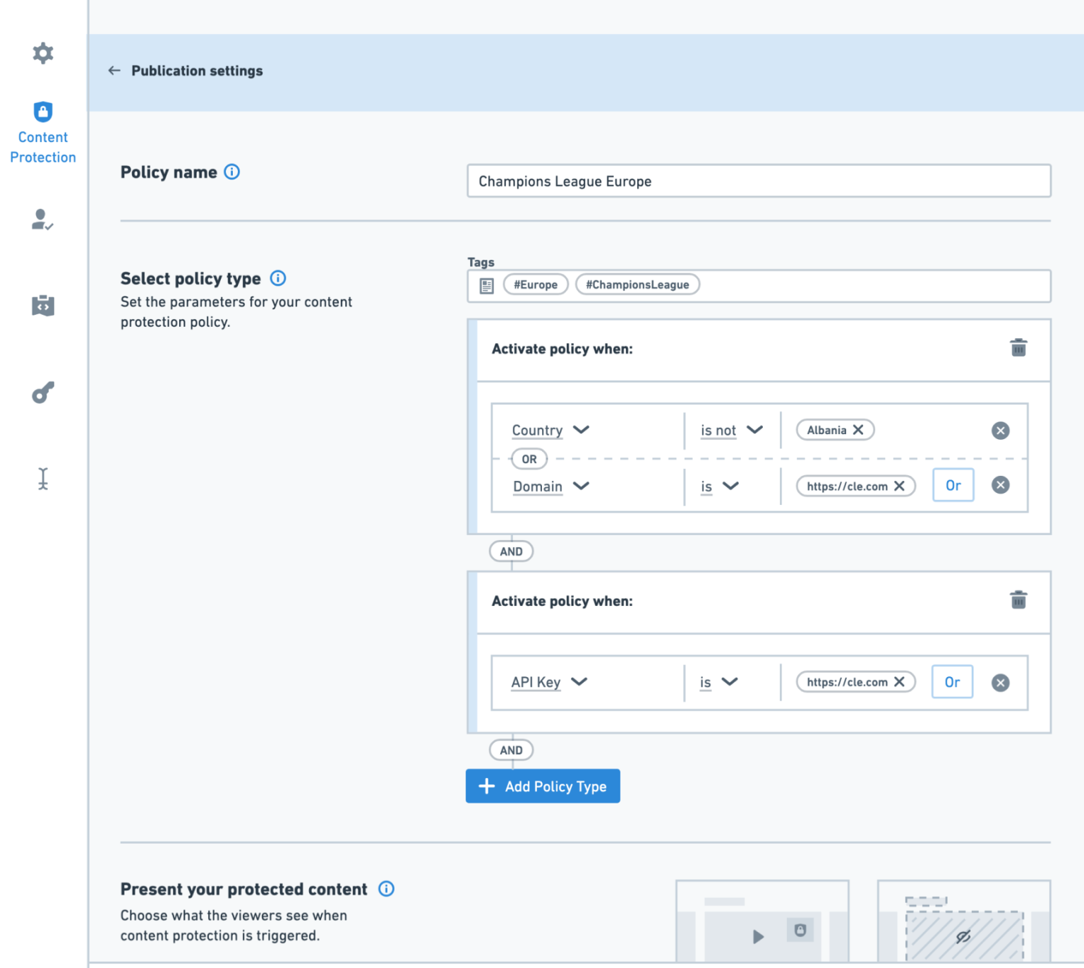
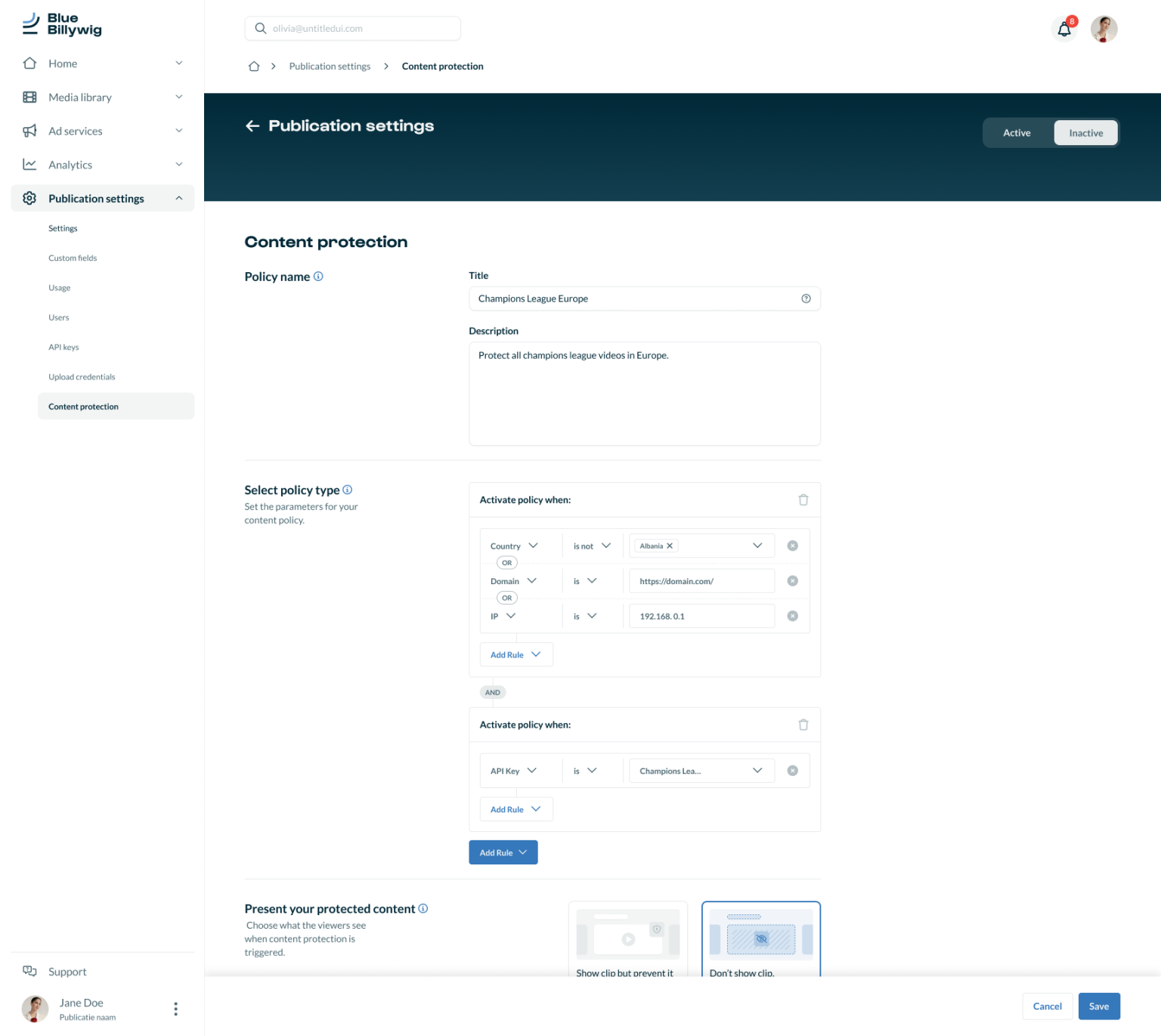
We chose for design thinking method due to its emphasis on user-centric innovation, providing a structured approach to problem-solving while encouraging creativity and empathy.
Our process
Understand the users’ needs and perspectives:
Gauge Initial Reactions
Assess customers’ first impressions of the Content Protection mechanism. Is the page’s purpose clear? Does it feel intimidating?
Test Design Intuitiveness
Evaluate if users can navigate Content Protection with minimal instructions. Can they achieve their goals without detailed guidance?
Gather Feedback on User Flow
Determine if the functionality meets user expectations. Are the steps logical? Do users get confused? Are any features missing?
Assess Practical Use
Check if the proposed implementation is practical for real-world use. Does it meet customer needs effectively?
Test Variants Scripted Testing
Conduct tests with tasks to create a Content Protection Policy using:
Limit clickable elements to main features, informing users beforehand. We used the Think Aloud method to understand their thought process.
Clearly define the problem or challenge to be addressed:
Keep it Simple:
Not all users are “power users”; make it easy for everyone to set and manage policies.
Trust:
Limit the ability to create and update policies to a few users.
Transparency:
Allow all OVP users to see what policies are set.
Visuals and Explanations:
Provide easy-to-understand visuals and clear explanations.
Select Multiple:
Enable users to select multiple countries at once for policies.
Generate a wide range of potential solutions through brainstorming:
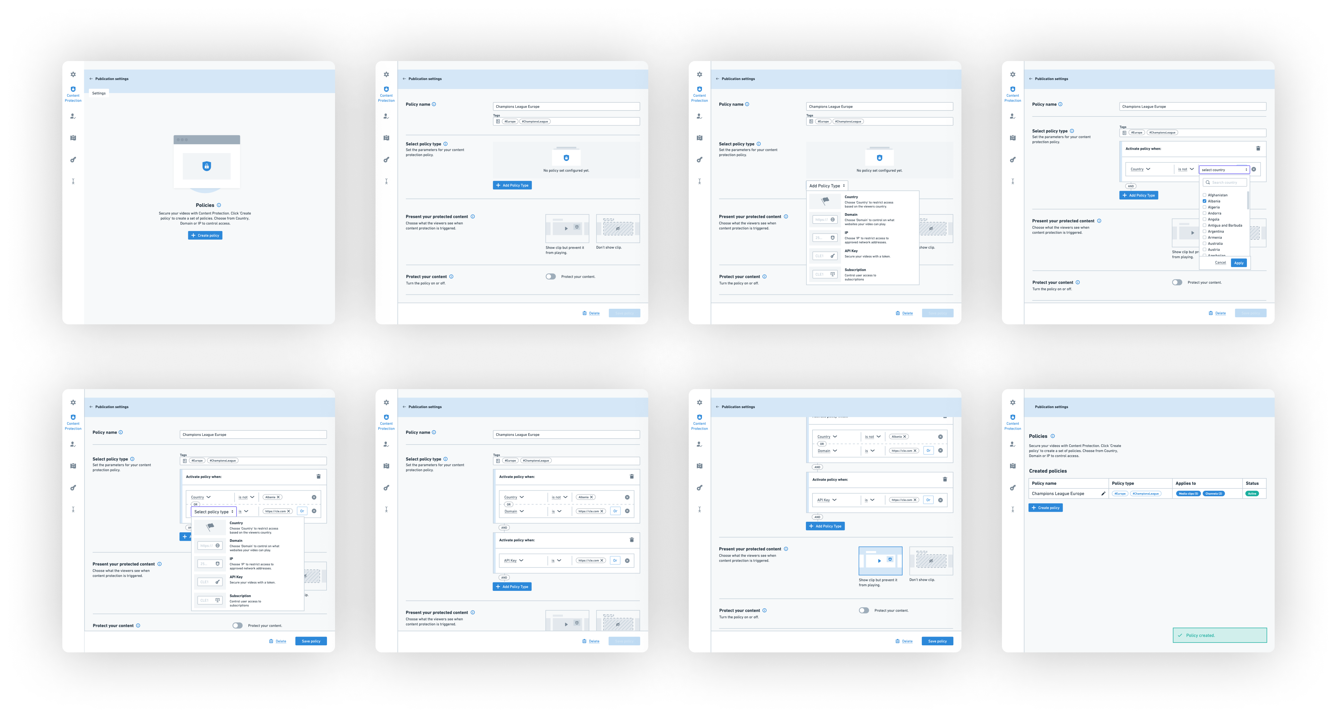
I created wireframes showing two different user flows (one with a wizard and one without). My goal was to make it as simple and understandable as possible. Because it’s quite technical, I focused on making it feel intuitive. I researched similar mechanisms and experimented with them.
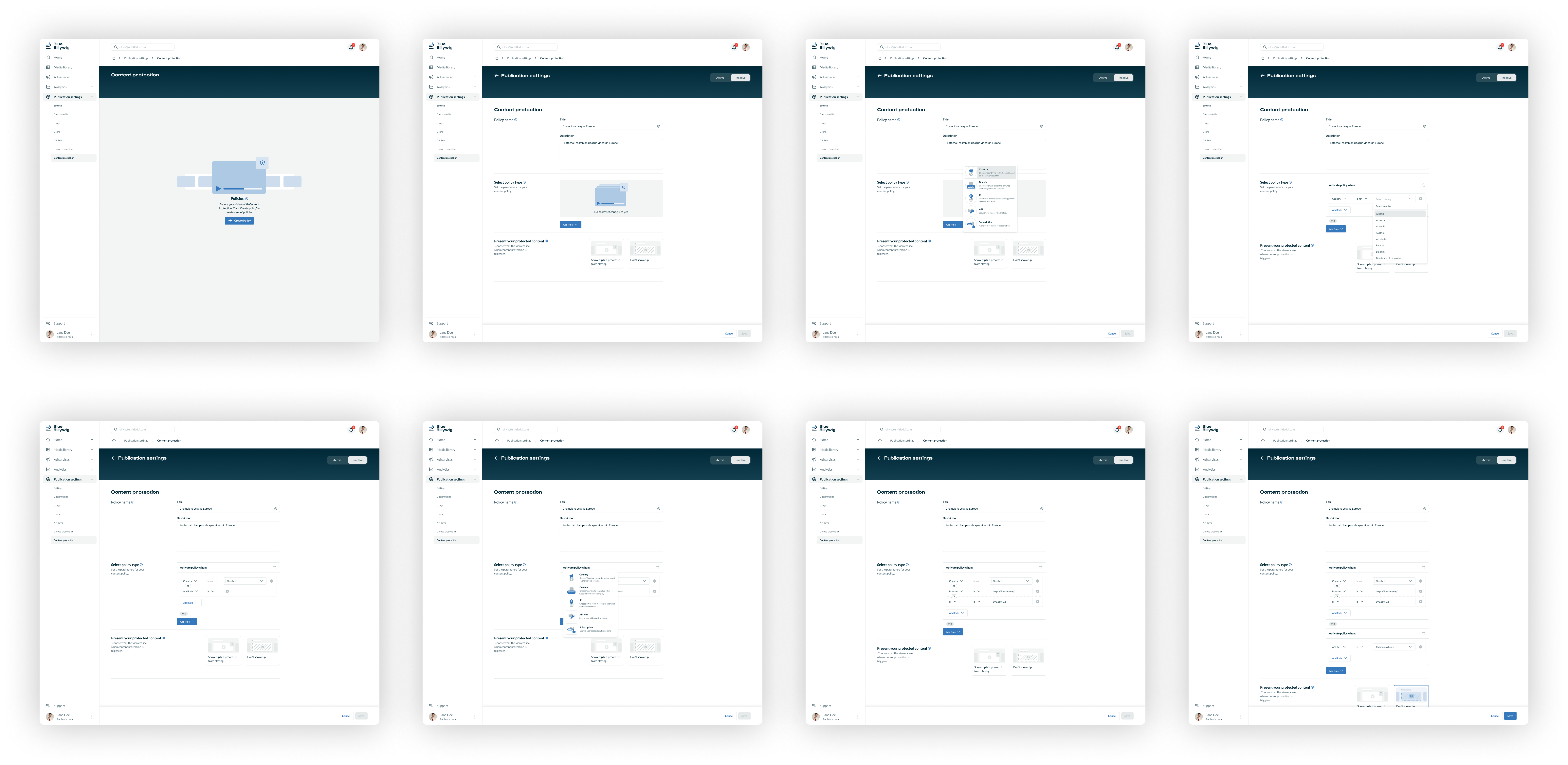
After several meetings with the dev team and the client, I visualized a method in wireframes that everyone agreed on. Then, I translated these wireframes into pixel-perfect designs in Figma, matching the new platform redesign.
Make specific representations of the proposed solutions.
While visualizing the flows, I also thought about how we should display certain notifications in the player skin. For example, how do you show messages when users don’t have permission to watch a video?
These screens also need to be configurable. I discussed this with the team and shared our findings in a meeting. I also brought prototypes to ensure we were all aligned with the solutions.
Gather feedback by testing the prototypes with users.
During the testing phase, I showed all the solutions again to the dev team and customers. By sharing and collecting feedback more frequently, the chance of major changes being needed was much smaller.
This was true for both the dev team and the client. This allowed me to finalize the designs and hand them over to the dev team.
Refine and improve the solutions based on user feedback, repeating the process as needed.
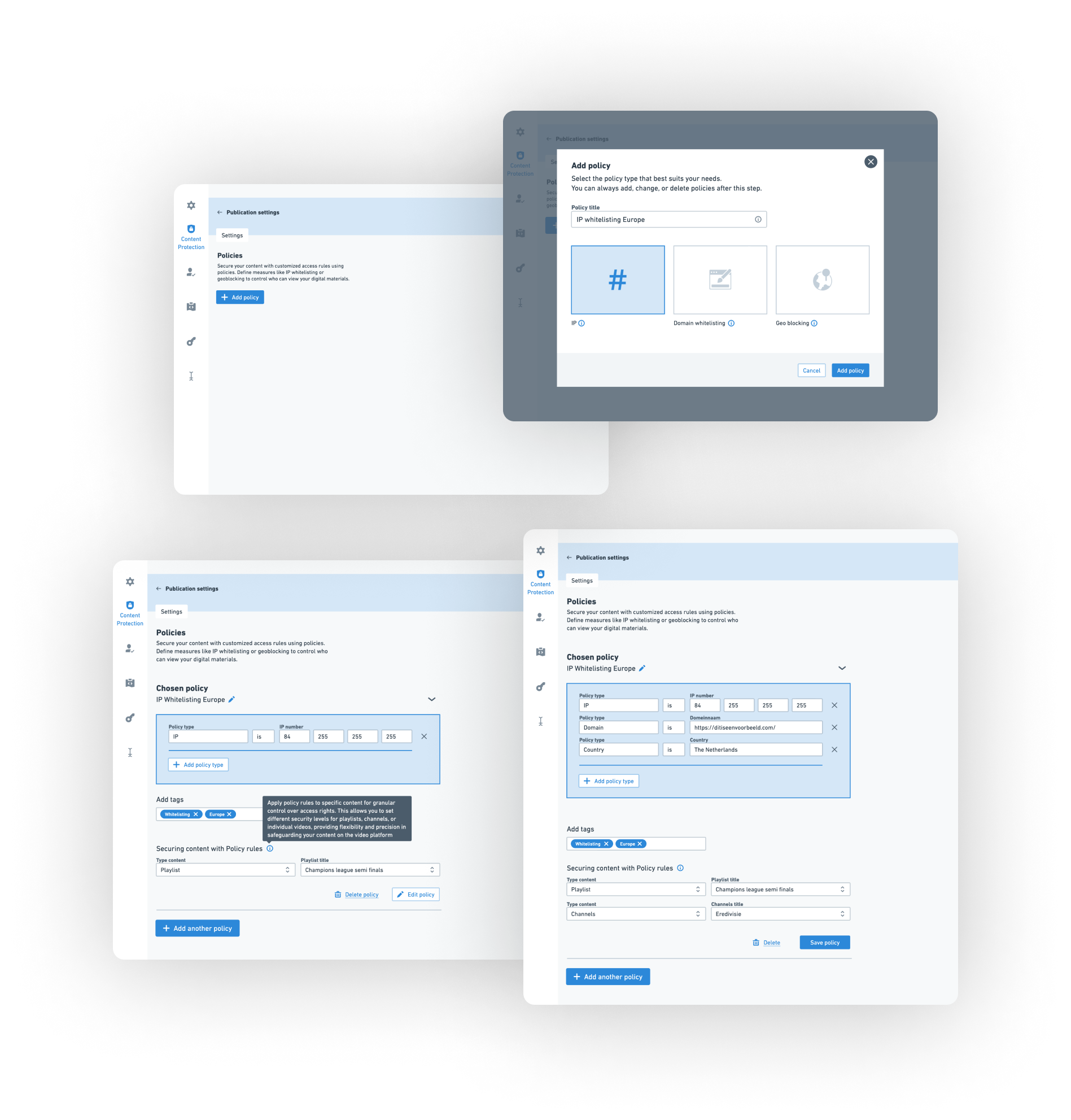
We created new components because the current mechanism didn’t feel very intuitive. It was important to provide users with a user-friendly interface. We also decided not to use the wizard version because there was only one step, and a wizard usually has multiple steps. Now, you can choose a policy with a button, which takes you to a screen where you can create or adjust the rest of the policies.
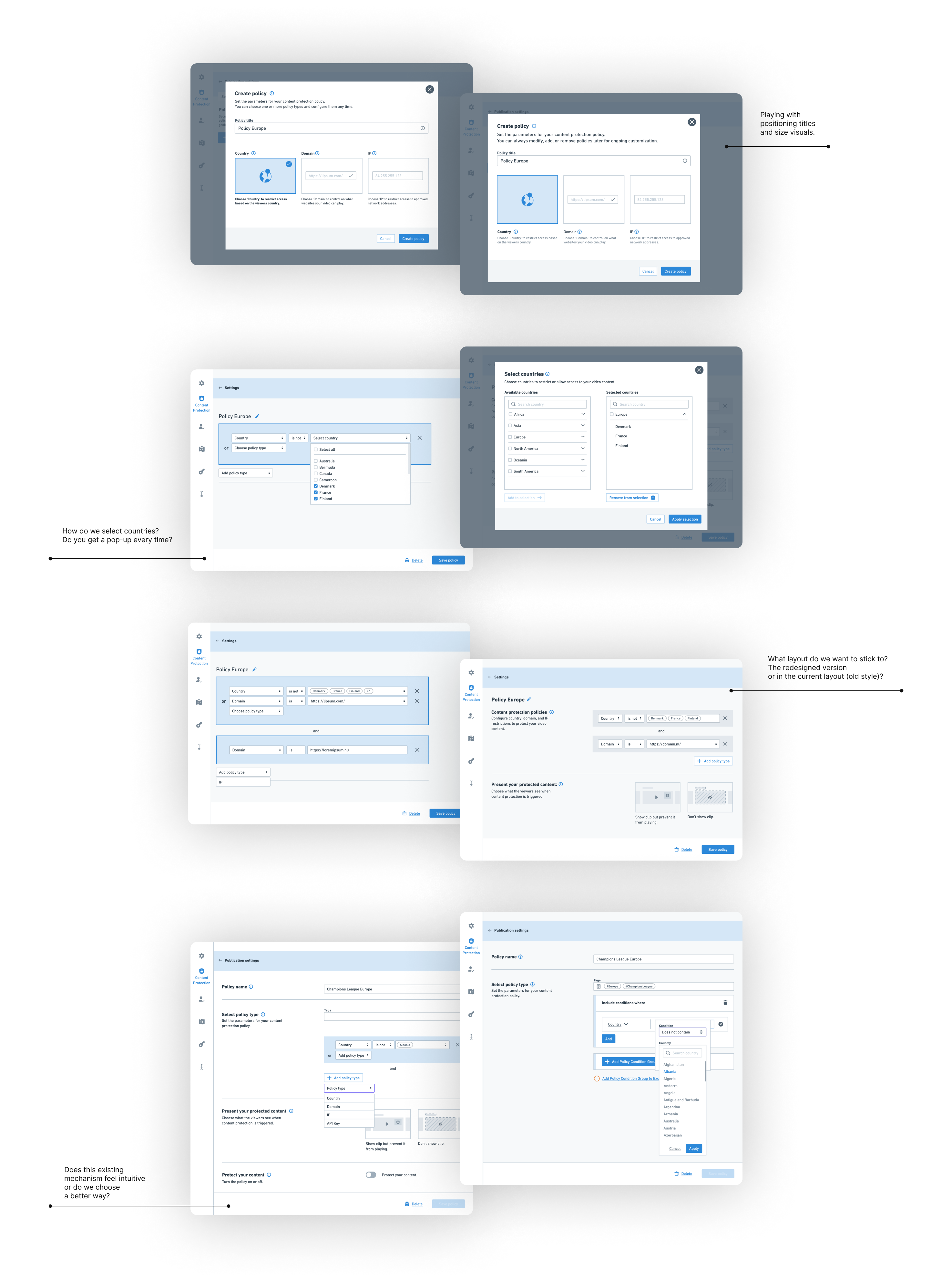
Before diving into Figma, I started by sketching concepts the old-fashioned way. These wireframe sketches helped me outline ideas and structure before moving on to detailed design work.
Wireframing provided a simplified blueprint, making the transition to the more refined stages in Figma smoother. In Figma, I fleshed out the designs with greater detail and interactivity.
Considerations during wireframe development:
To easily explain what policies involve and to let users choose one to start configuring, I wanted to make it visual with a supporting title and description. The initial idea was to show this in a modal.
However, after meetings with the development team and customers, we decided against using a modal because it would appear every time a policy is chosen. If we used a modal initially and then moved away from it later, it would be inconsistent and confusing for users.
So, I combined two ideas: using a dropdown menu with illustrations, titles, and descriptions at the button for creating a new policy. This way, users always have a clear choice and we maintain consistency.
Initially, we wanted to use as many existing components as possible. These components are used throughout the platform. To save time, I considered designing the policy creation process with these existing mechanisms.
However, it quickly conflicted with user needs for an intuitive and clear interface. Considering the redesign and the outdated mechanisms we wanted to use, this was the right moment to introduce something more modern and intuitive that we could use for years to come.
Fortunately, I received support for this, and ultimately, this version is appreciated by both the team and the customers.
I always find it a big challenge to make complex technical processes more human. I often do this by using terminology that users expect when interacting with the interface.
Additionally, I try to create as many supportive illustrations as possible so users can instantly understand the functionalities. I’ve applied this approach to the visuals in the dropdown menu as much as possible.
After visualizing the wireframes, we achieved:
Link to all files:
Link to all files:
I have learned how content protection works and understood the technology and terminology. I also learned about different types of policies that can be created. This knowledge helped me design a more intuitive user interface. Although the technical meetings with the development team were sometimes hard to follow, using wireframes made it easier to discuss and understand.
I enjoyed getting enthusiastic feedback and involving the team in all stages of the design process. This collaboration allowed us to create something valuable for end users together.