
With the branded video player I created, your videos stand out by easily customizing colors, logos, and thumbnails. The user-friendly editor allows you to create a custom player in minutes, with updates instantly visible on your website.
I undertook a redesign of the player for three main reasons. Firstly, to create the most aesthetically pleasing player skin on the market, enhancing user experience and interface.
Secondly, to improve performance, making the player more lightweight and less cumbersome.
Lastly, to use a more efficient code base, aligning with our mission to achieve net-zero emissions through a more eco-friendly video player.
Role
Facilitate brainstorming sessions. User research, wireframing, prototype.
Methods
Design thinking, usability testing, A/B testing, wireframes, crazy 8, Agile, scrum.
Team
Stakeholders, Product owners, Product manager, front-end developers, back-end developers, designers.
The player skin was outdated. Buttons were too small or not well-aligned, making it feel non-intuitive. Given that videos in the player skin were used by major clients like Allerhande and Ajax, it was essential to have a modern player skin that matched the style of their websites.
Our goals
We wanted to create the best player skin that looks modern and is easy to use. This player skin should rank alongside major player skins like YouTube and Vimeo.
The number of options made it too complex for users to create a player skin. The goal was to offer enough customization options without overwhelming users. The idea was “less is more.”
This player not only needed to look modern but also feel intuitive on every possible screen, from desktop to mobile.
The old player skin was outdated, and the code needed cleaning up and partly rewritten to make loading videos easier and display transitions smoother.
We made sure our modern player is accessible to everyone by following WCAG guidelines, focusing on level AA. This ensures inclusivity for our target audience without compromising on design.
“How can we improve the user experience and ease of use of our player skin, which is also customizable at the same time so that it matches the corporate identity of the customer?”
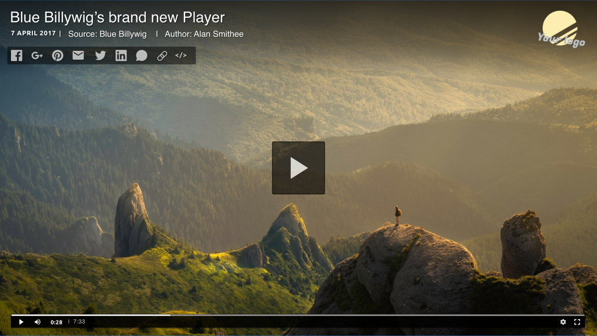
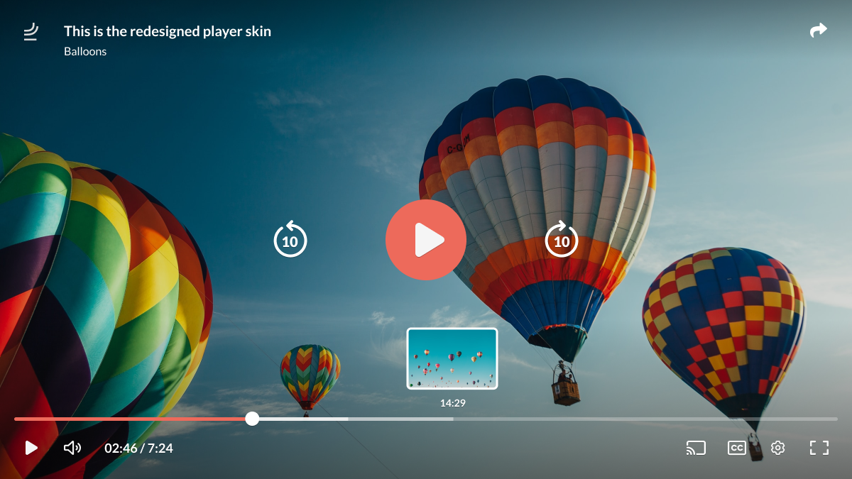
We chose for design thinking method due to its emphasis on user-centric innovation, providing a structured approach to problem-solving while encouraging creativity and empathy.
Our process
Understand the users’ needs and perspectives:
Clearly define the problem or challenge to be addressed:
Generate a wide range of potential solutions through brainstorming:
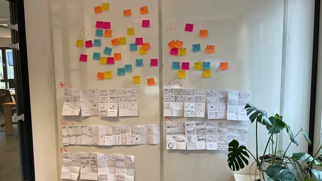
Brainstorm Session: Player Skin
Card Sorting Brainstorm Session:
Brainstorm Session with Crazy 8 Method:
Make specific representations of the proposed solutions.
Gather feedback by testing the prototypes with users.
Refine and improve the solutions based on user feedback, repeating the process as needed.
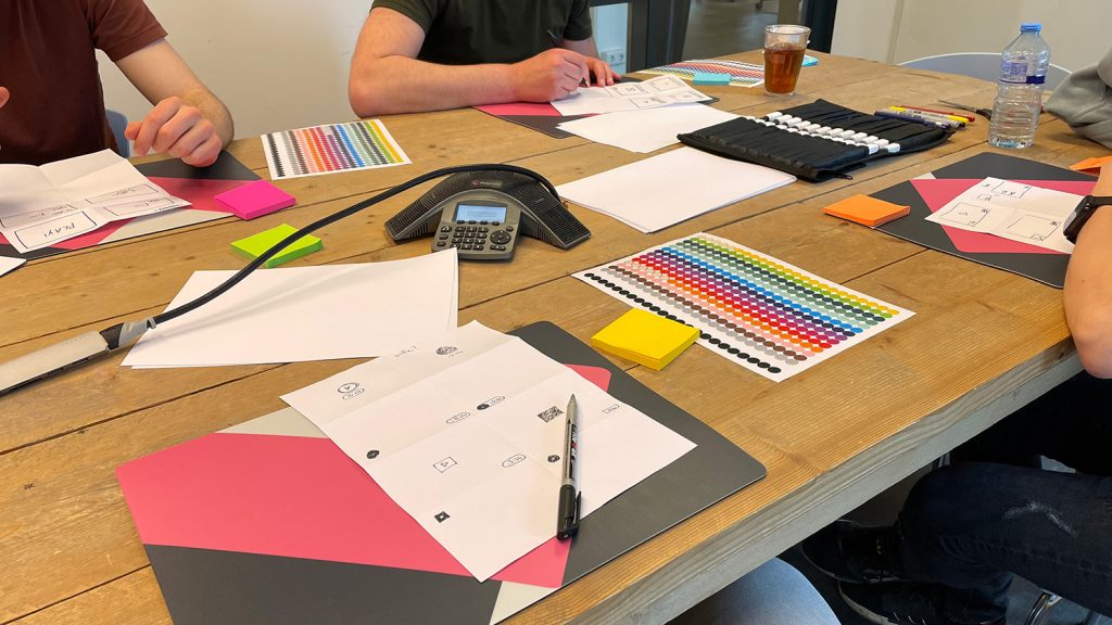
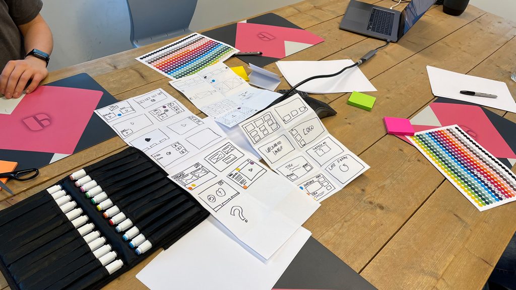
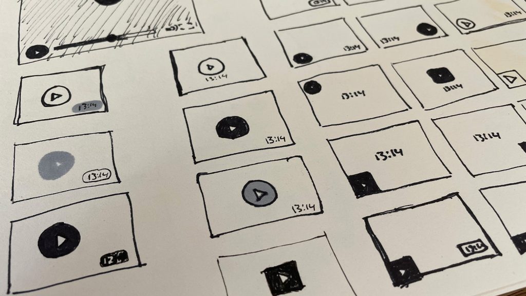
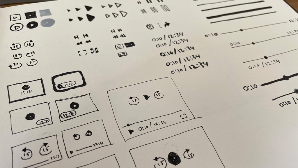
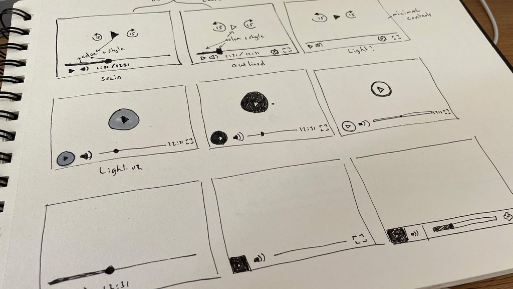
Before diving into Figma, I started by sketching concepts the old-fashioned way. These wireframe sketches helped me outline ideas and structure before moving on to detailed design work.
Wireframing provided a simplified blueprint, making the transition to the more refined stages in Figma smoother. In Figma, I fleshed out the designs with greater detail and interactivity.
Considerations during wireframe development:
I’ve contemplated how and where I want to visualize the play button on the start screen. Additionally, I’ve considered where the user might want to see the title and time display.
The platform must accommodate many scenarios, making it crucial to design a player skin that fits each situation. These scenarios include live streaming, interactive video, shorts, channels, mobile, and audio content.
By tailoring the player skin to these specific use cases, we ensure an optimal viewing experience across different types of media and user interactions.
I prioritized making sure users can easily recognize the icons, and positioned them in a grid layout that feels intuitive for both desktop and mobile. I experimented with this approach, taking into account current trends and examining how existing players handle paddings, margins, and icon usage.
After visualizing the wireframes, we achieved:
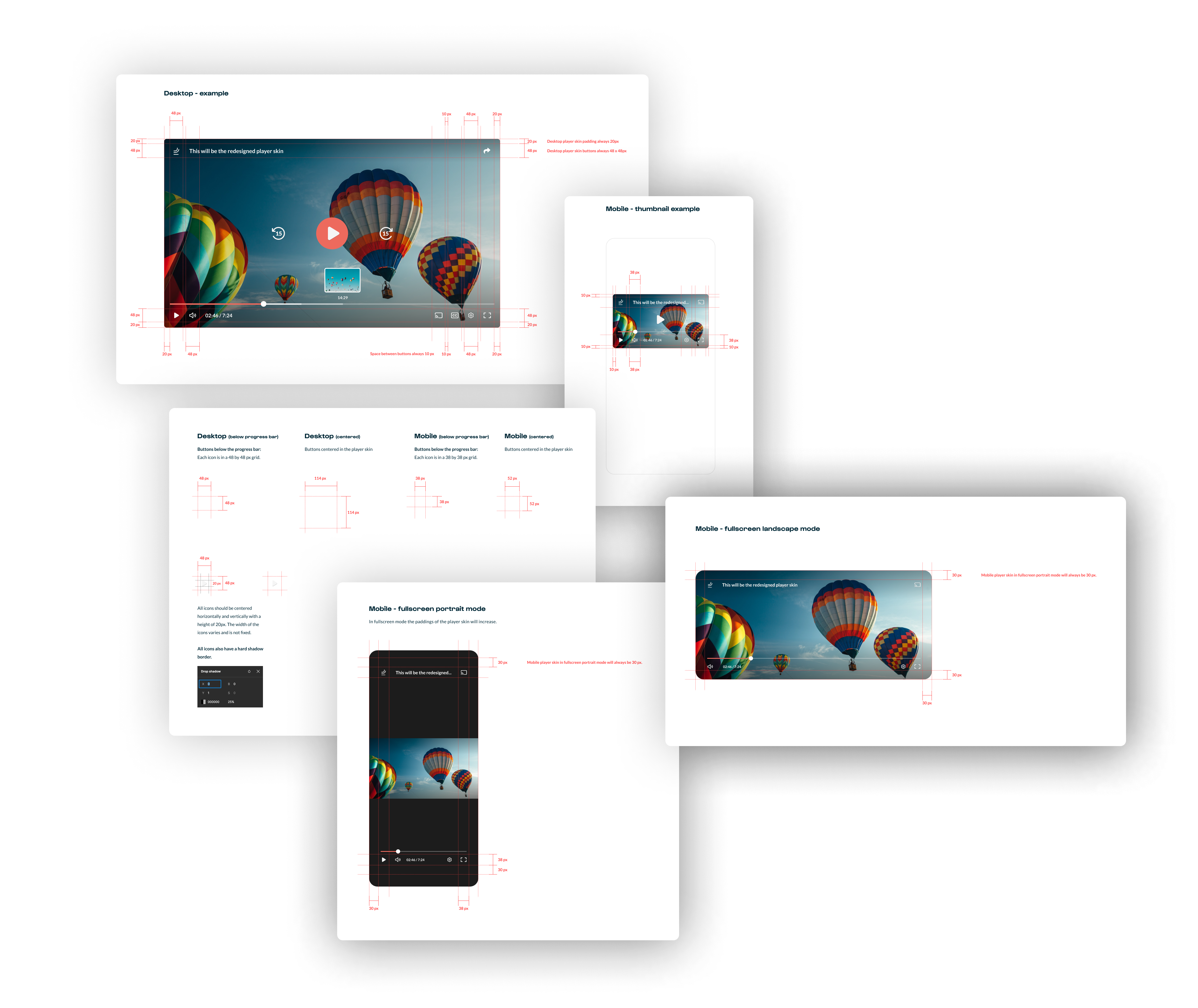

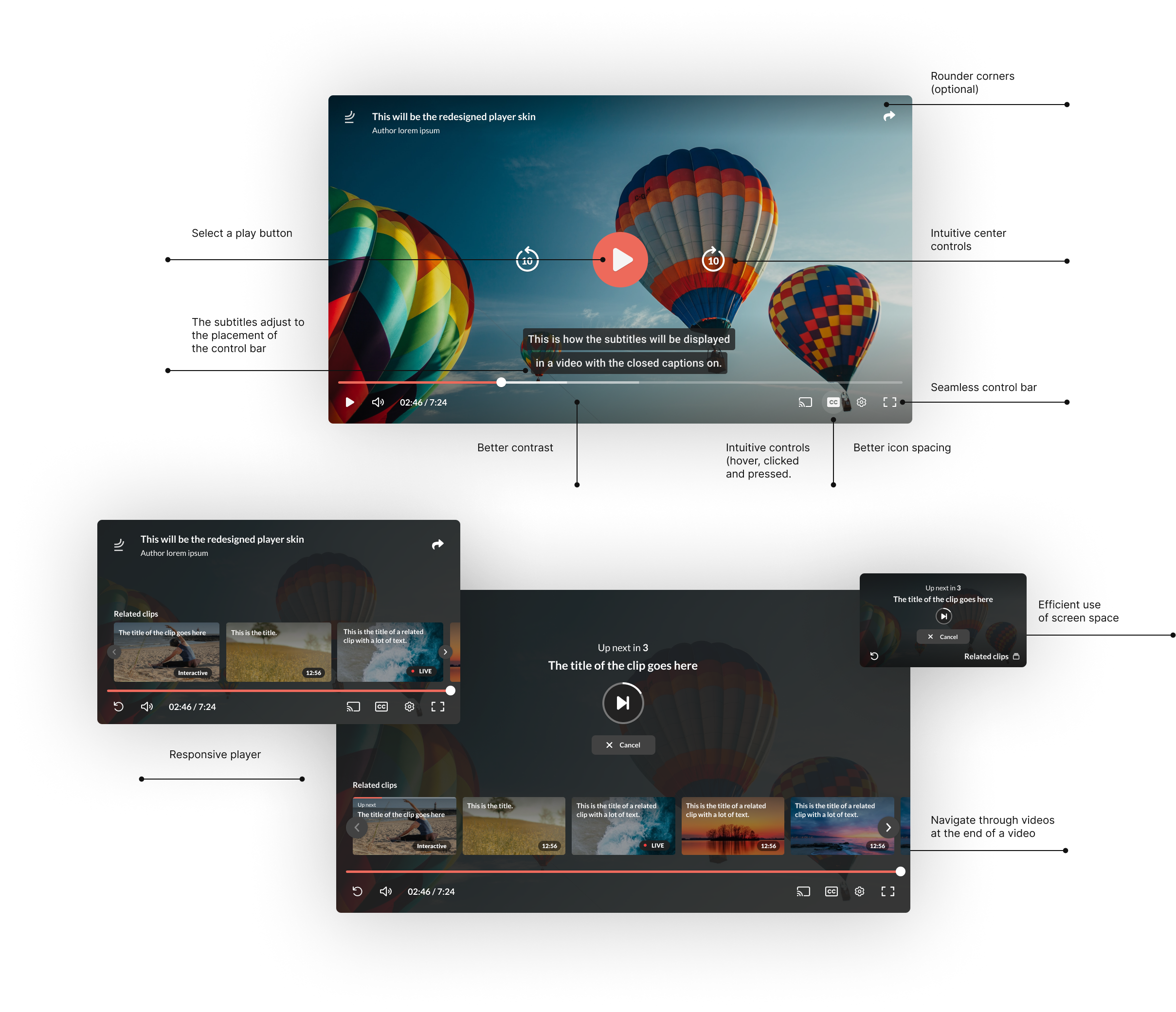
I learned that designing a player skin is more complex than it seems. It involves handling various states and ensuring responsiveness. We introduced a contrast checker for the play buttons, so if users choose colors with poor contrast, an automatic contrasting color is applied.
The player skin now includes a second design and additional features like chapters, highlights, and live video. These were designed with components, but in hindsight, a separate design system specifically for the player skin would have been better, similar to the OVP redesign.