
// Selected Work
Redesign the Player Skin
A redesign of the skin of a branded HTML5 video player, so that customers can make it their own and every control stays clear on every screen.
// My role
What I did, and with whom.
- Responsibilities
- Facilitating brainstorming sessions
- User research
- Wireframing and prototyping
- Team
- Stakeholders, product owners, a product manager, front-end and back-end developers and designers.
- Methods
- Design thinking
- Usability testing
- A/B testing
- Wireframes
- Crazy 8s
- Agile and Scrum
// The problem
A player that looked old, with controls that were hard to hit.
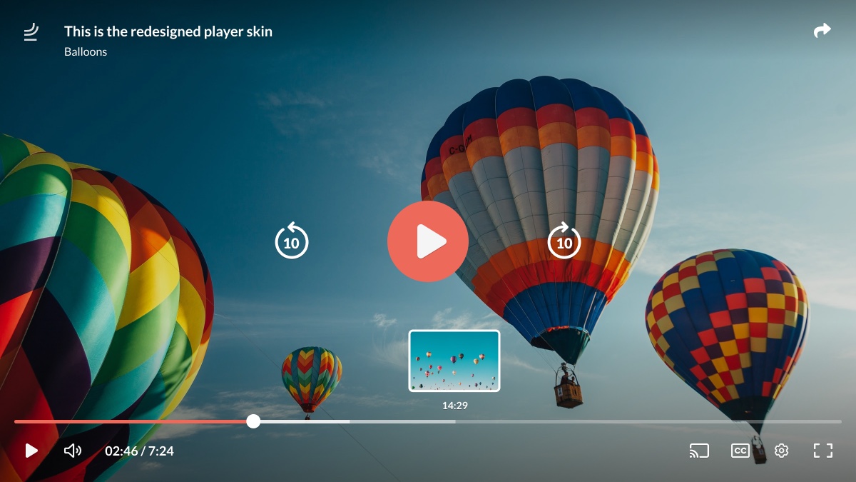
A redesign of the skin of a branded HTML5 video player: the controls, states and styles that sit on top of every video a customer publishes. Customers can change its colours, logo and thumbnails in an editor.
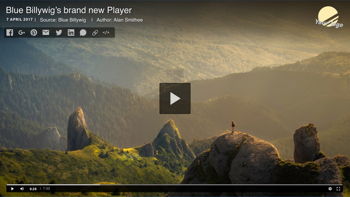
The player skin looked outdated. Buttons were too small or poorly aligned, which made the player feel unintuitive. Large customers use the player for their own videos on their own websites, so a modern skin that matches those sites was essential.
The redesign had three goals: a more visually appealing player for a better experience, better performance through a lighter and less cumbersome player, and a leaner code base.
// The thinking
Draw the controls before you design them.
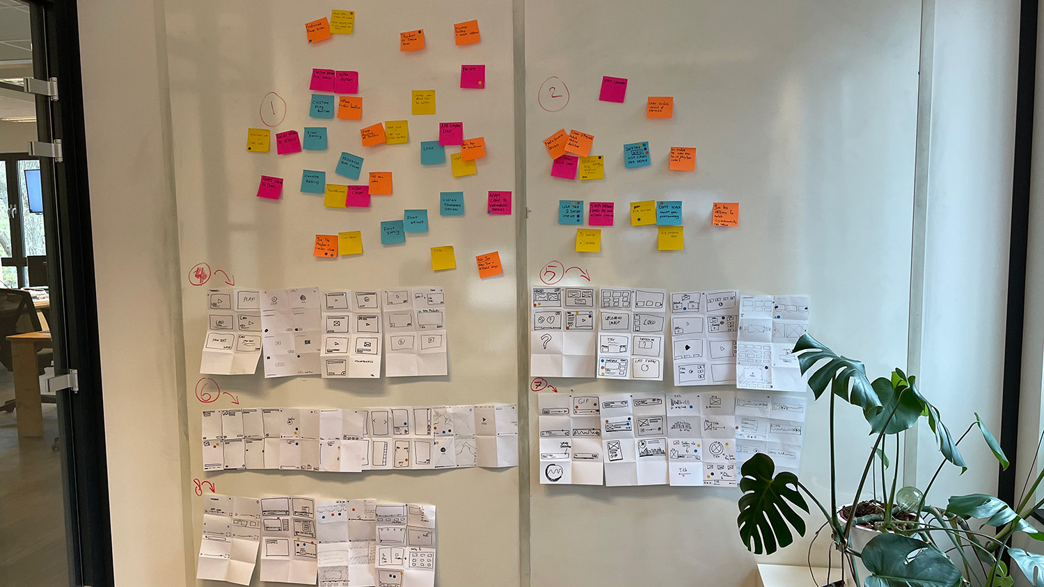
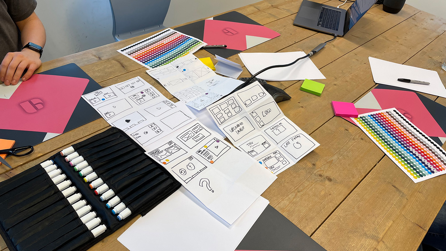
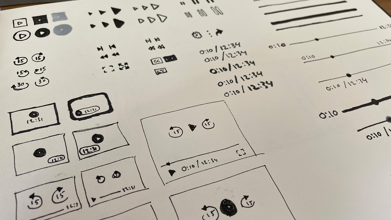
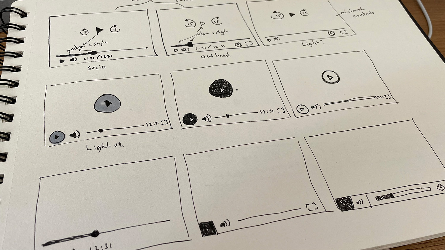
The work followed the design thinking method. Brainstorm sessions with colleagues used Crazy 8s: many quick sketches of controls, play buttons and layouts, pinned to the wall in numbered rounds and clustered by theme.
A player is a small interface with many parts, so the sketches looked at each part separately first: play button shapes, skip buttons, the progress bar, the time display, and how they combine into one clear whole.
What had to be solved
- LegibilityControls that are large enough, aligned and easy to read over any video.
- BrandingA skin that customers can match to their own website with colours, logo and thumbnail.
- StatesPlaying, paused, subtitles, related clips and up next, each designed on its own.
- ResponsivenessThe same player in a page, in fullscreen and on a phone in portrait and landscape.
// Key decisions
Four design responses, and what each one came from.
- 01
Controls on a grid
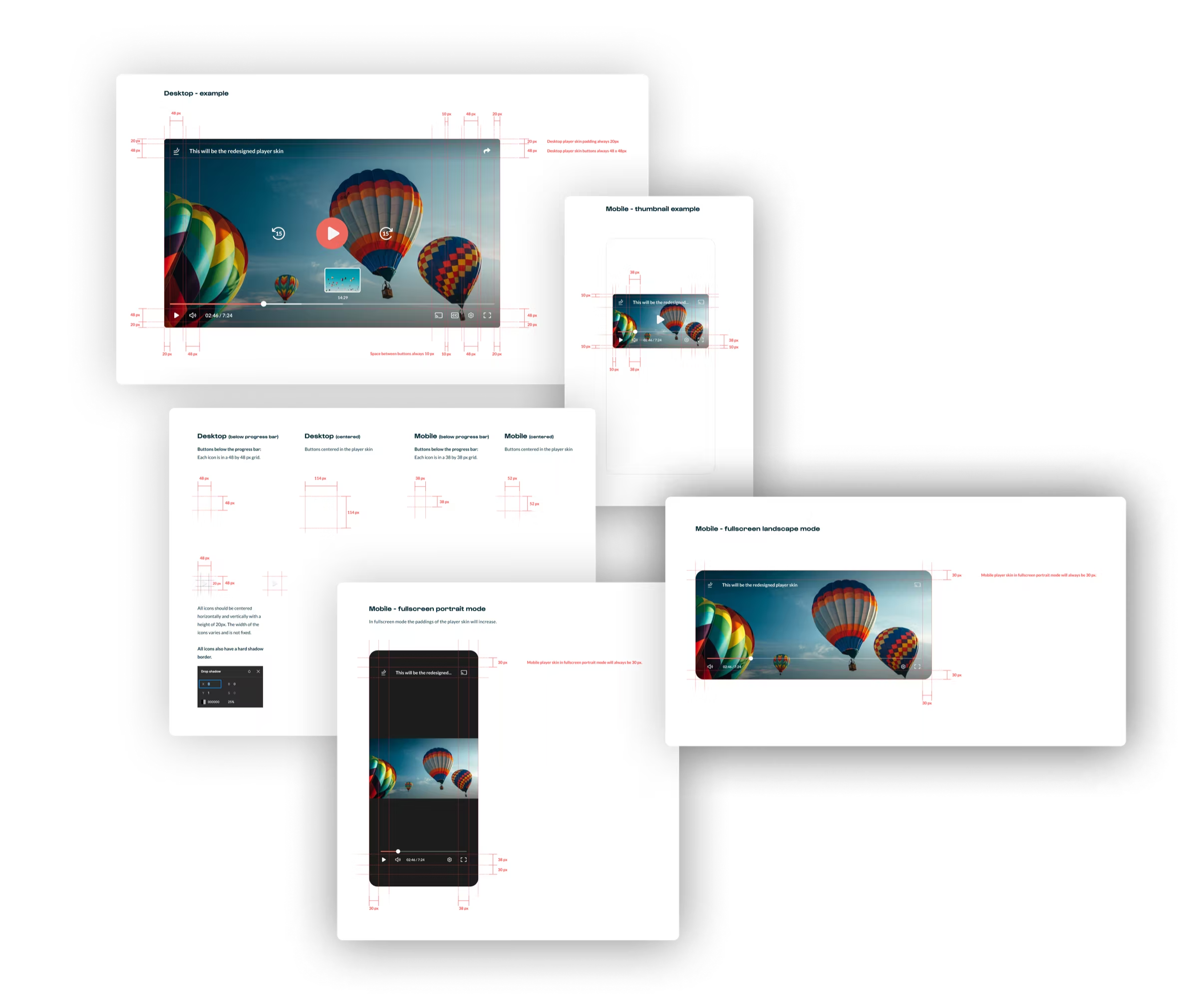
On desktop every control sits in a 48 by 48px grid with 20px of padding. On mobile the grid is 38px, and in fullscreen the padding grows to 30px.
- Why
- The old buttons were too small or misaligned. A fixed grid makes sizes and spacing predictable on every screen.
- 02
A skin that takes the customer's brand
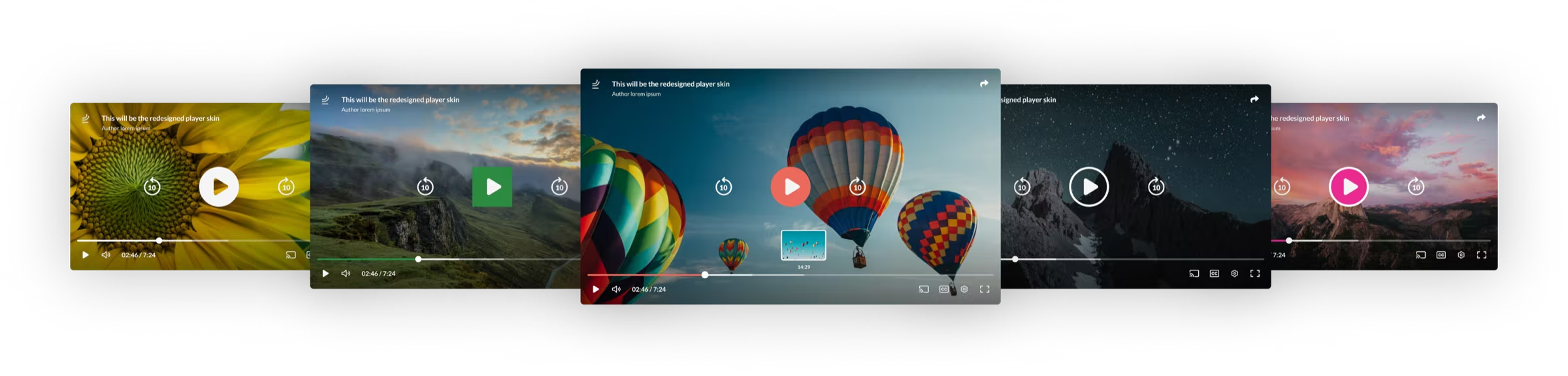
Customers set colours, logo and thumbnail in an editor. There are two configurable skin types and several play button styles, from solid to outlined.
- Why
- Large customers need a player that matches their own website. Letting them choose within a designed system keeps the player coherent.
- 03
Contrast checked automatically
For play buttons, a contrast checker applies a contrasting colour when the colours a customer picks are too close together.
- Why
- Freedom to choose any colour should not make the controls unreadable. The check protects legibility without limiting the choice.
- 04
Every state drawn
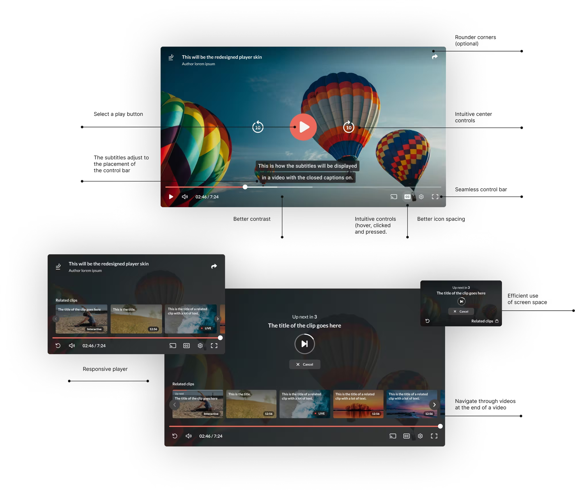
The skin was designed state by state: playing, hover, subtitles, related clips, up next with a countdown, and desktop, mobile, fullscreen portrait and fullscreen landscape.
- Why
- A player skin is more complex than it looks, because of the many states and the need to be responsive. Drawing them explicitly keeps the behaviour consistent.
// The intervention
A modern skin that customers can make their own.
The new skin has larger, aligned controls, ten-second skip buttons, a thumbnail preview with timestamp while seeking, subtitles with a readable background and, for longer videos, related clips and an up-next countdown.
It was documented with measurements for desktop and mobile, and with a page where all the player skin scenarios can be tried.
// Outcome
A player is small, but every pixel and state matters, and it works best when customers can make it theirs without breaking it.
The project delivered a fresh look with new customisation options and two configurable types of player skin, several play button styles and documentation of the skin and its scenarios.
Later, a second design and extra features (chapters, highlights and live video) were built with the same components.
No usage or performance metrics are published for this project, so none are claimed here.
What I learned
- Designing a player skin is more complex than it looks, because of the many states and the need for responsiveness.
- Adding a contrast checker for play buttons keeps custom colours legible.
- A separate design system for the player skin would have been better, as with the redesign of the platform itself.
// Contact
Have a complex product problem? Let’s make it clear.
- Emailhello@denizign.nl
- ProfileLinkedIn (opens in a new tab)