// Selected Work
Redesign Online Video Platform
A redesign of the media library of an online video platform, built on a new design system, so that customers can find, prepare and publish video on their own.
// My role
What I did, and with whom.
- Responsibilities
- Facilitating brainstorming sessions
- User research
- Wireframing and prototyping
- Mentoring a junior designer
- Team
- Stakeholders, product owners, a product manager, front-end and back-end developers and designers.
- Methods
- Design thinking
- Usability testing
- Wireframes
- Crazy 8s
- Agile and Scrum
// The problem
A powerful platform that new users could not read.
A redesign of the media library of an online video platform: the overview where customers manage their videos, and the detail page where they prepare a video for publication. Both were built on a new design system.
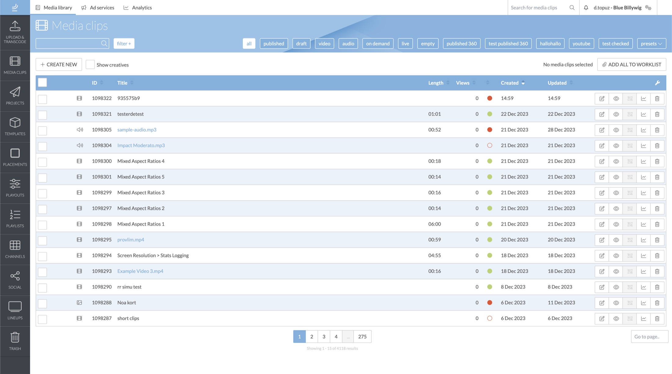
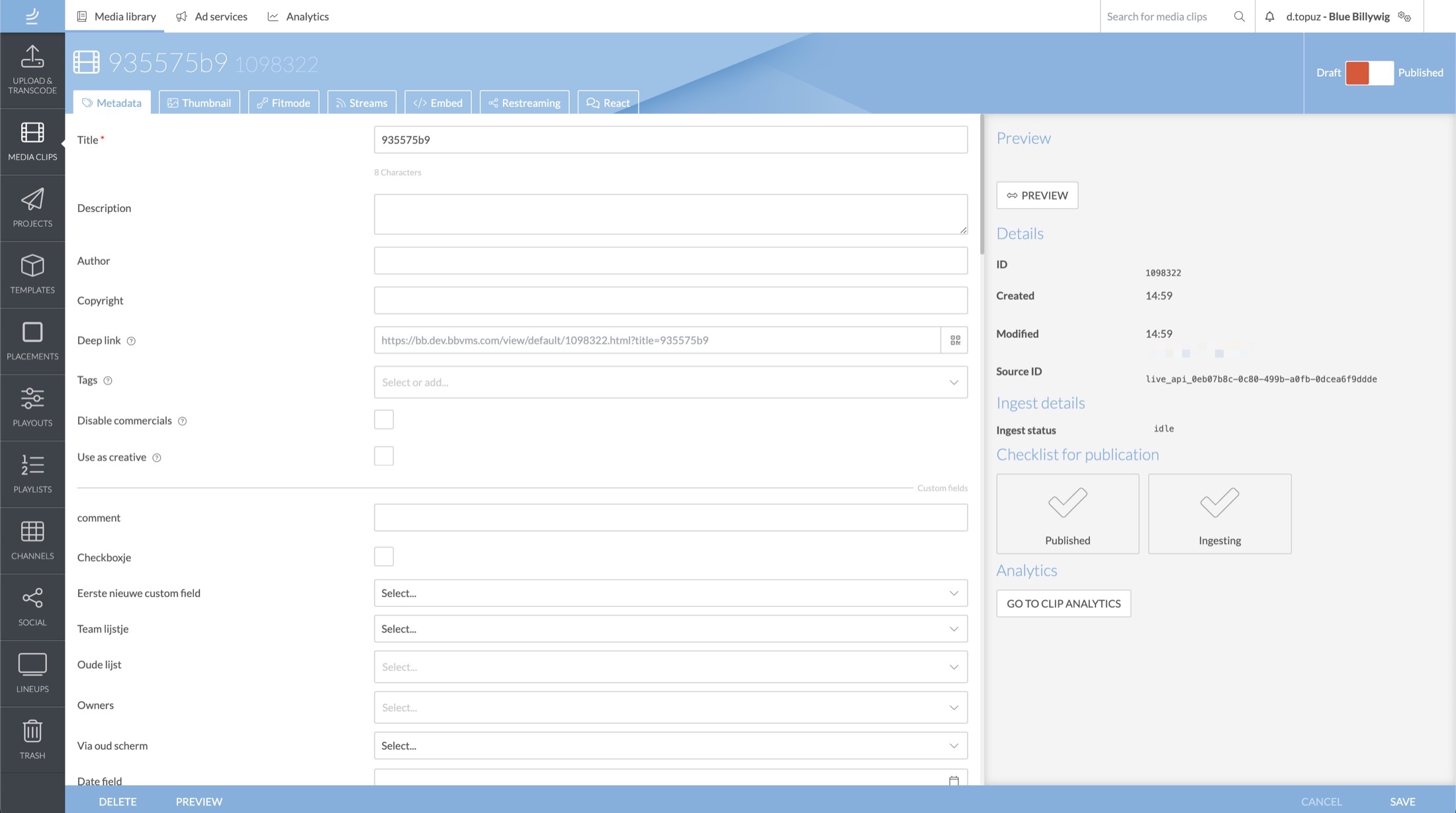
The platform lets businesses and content creators, from small companies to solo creators, upload, organise, edit and publish video. It has many strong features. For new users that was the problem: there were too many options, and it was easy to get lost in all the choices.
The same pattern showed up across teams and customers: an outdated look and feel, unclear terminology, pages where everything had the same importance, and little guidance for people who were new. The goal was to help customers work more independently in the platform.
// The thinking
Listen first, then design.
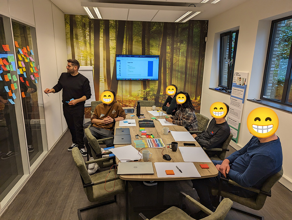
The work followed the design thinking method. It started with colleagues from different teams, because they use the platform every day and help customers with it. Each session ran for an hour, with screen and audio recorded, so it was visible what a person was thinking, feeling, doing and saying. The same approach was then applied with customers who had different levels of experience.
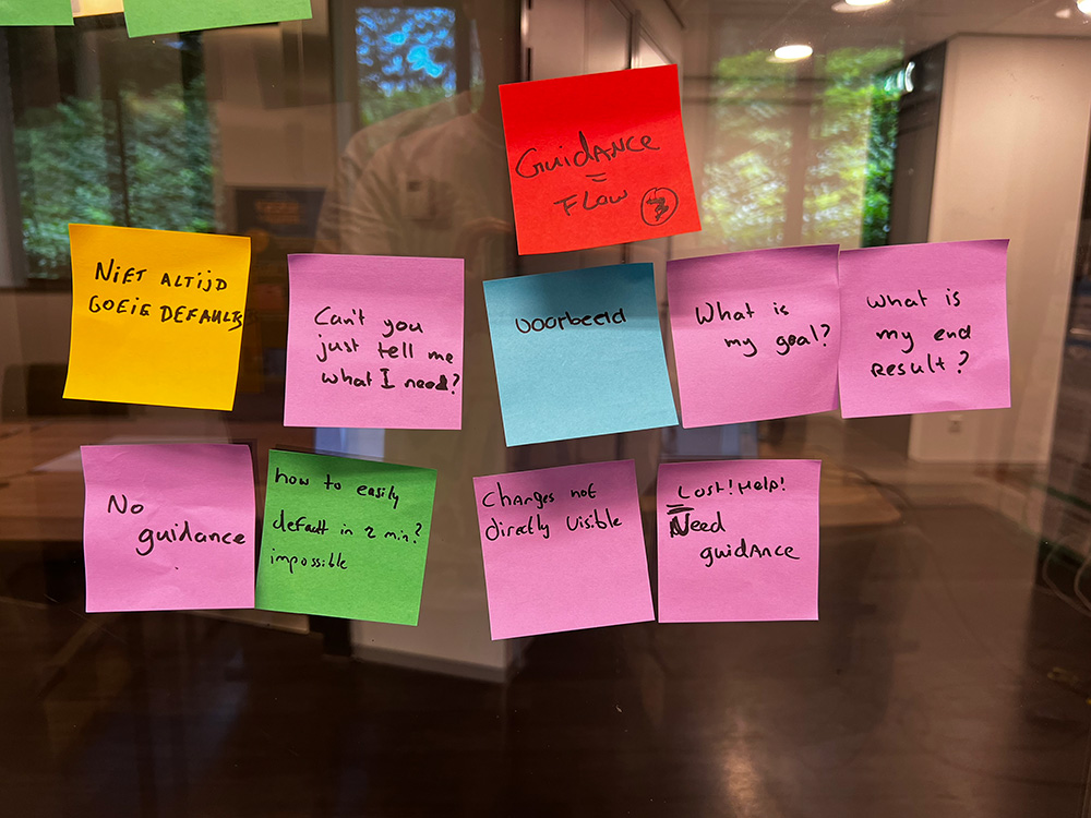
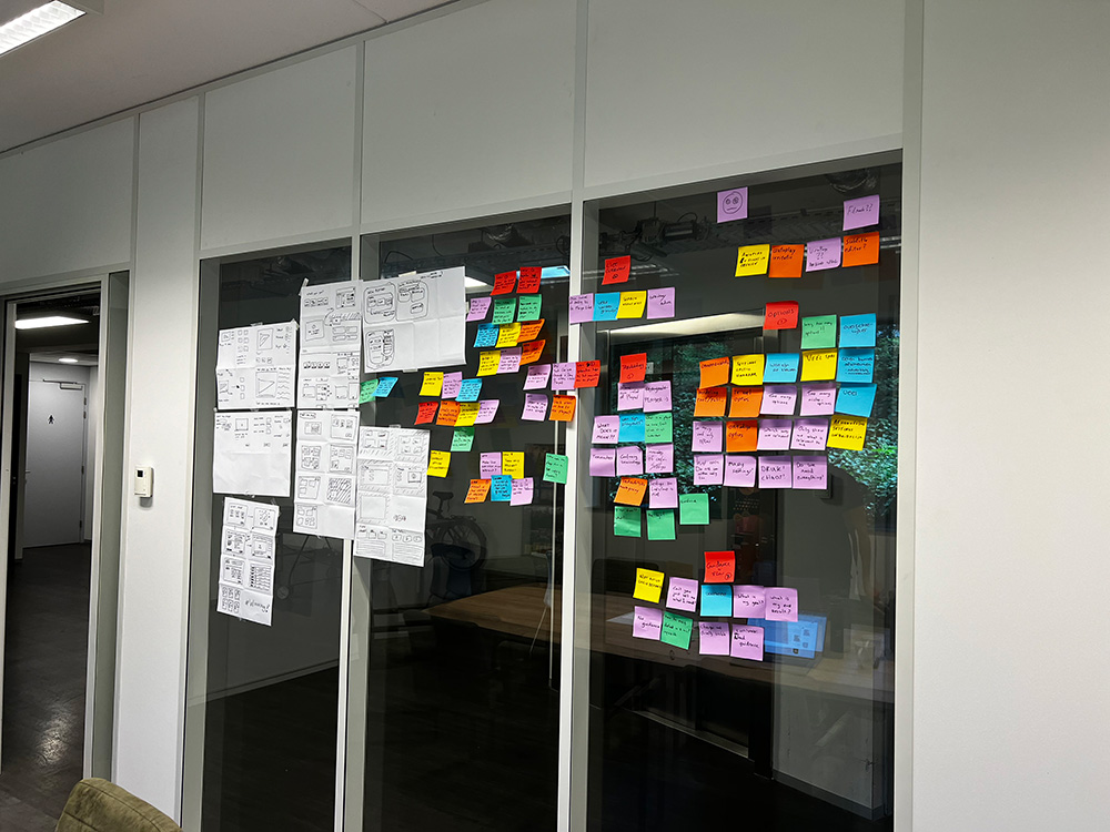
The results were grouped by area of the platform: start screen, navigation, ad services, analytics, media clips, playouts, projects, playlists, channels and search. For each group the problem was written down, with “how might we” questions to take into ideation.
Ideation happened in brainstorm sessions with colleagues. The decision was to clean up the content first and to optimise the information architecture afterwards.
What the research said
- HierarchyEverything on a page looked equally important, so nothing stood out.
- TerminologyNames of pages and options were unclear, and some were barely used.
- GuidanceNew users wanted to be led through a task. The platform did not tell new and advanced users apart.
- FindabilityFilters went unused and finding one clip among many pages was hard. Users asked for search that suggests as you type.
// Key decisions
Four design responses, and what each one came from.
- 01
A library that starts with the content
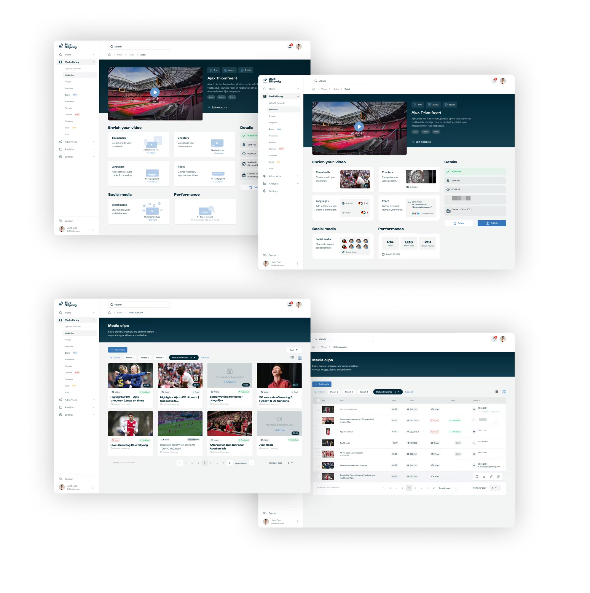
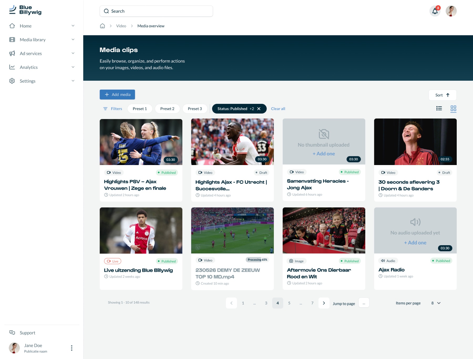
The media overview shows videos as cards with a thumbnail, type, status and title. The table stays available behind a view toggle.
- Why
- Finding one specific clip among many pages was a recurring problem, and a thumbnail is the quickest way to recognise a clip. People who work in bulk keep the table.
- 02
Filters that get used
Filters are reachable from one place, saved as presets, and the active ones stay visible as removable chips with a clear-all.
- Why
- The old filter options were not used because they were not user-friendly. Presets turn a repeated filter into one click, and visible chips show why a list looks the way it does.
- 03
A detail page built around the next step
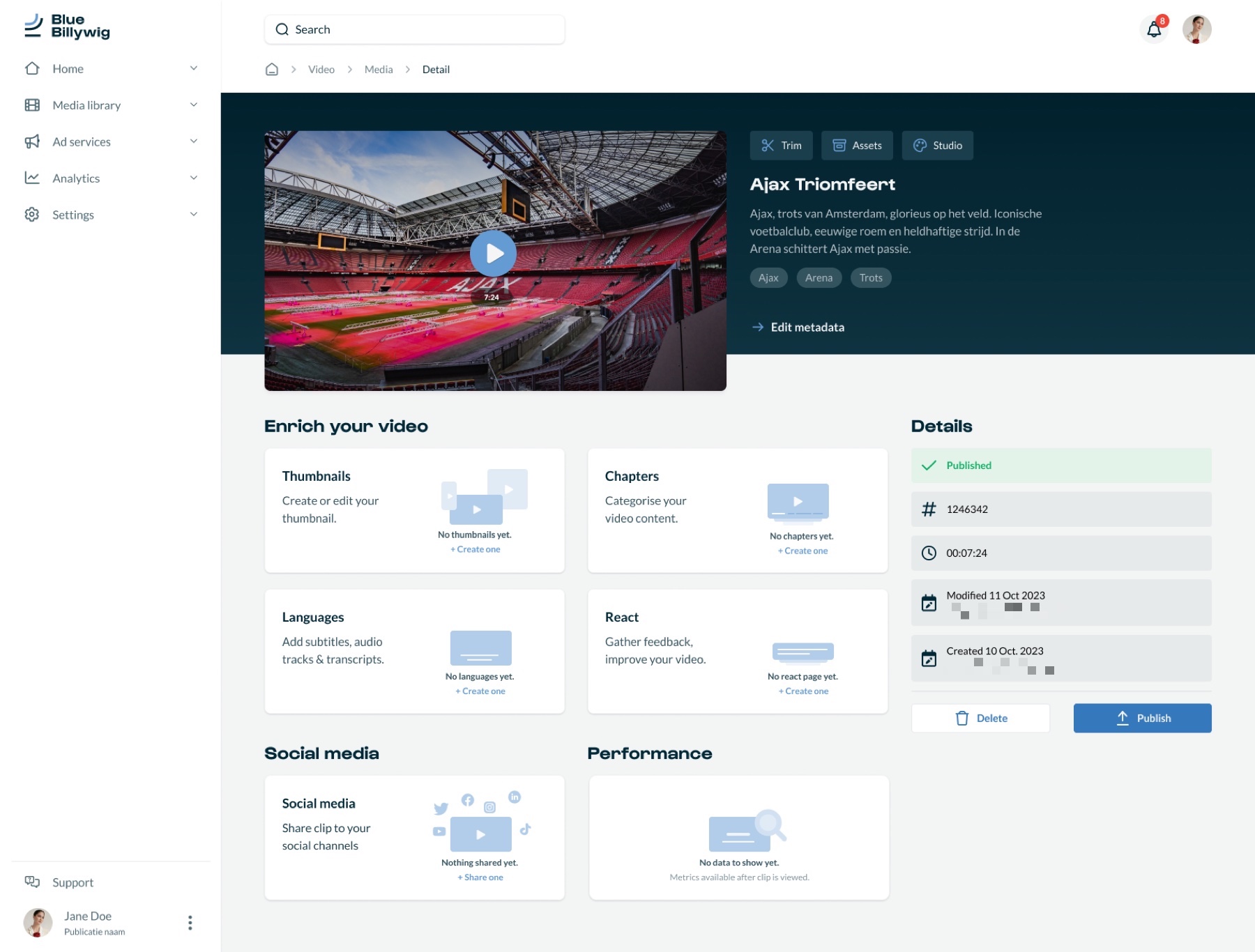
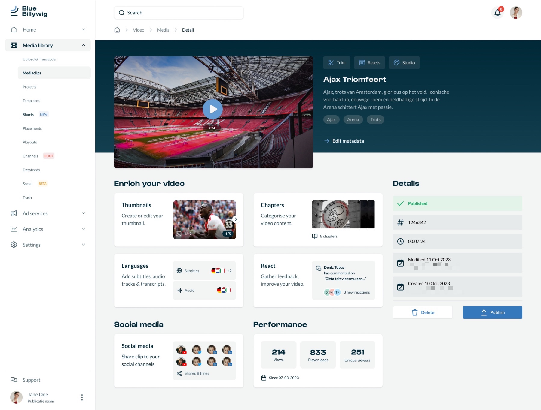
The seven tabs became one page: the video and its title on top, then blocks to enrich it (thumbnails, chapters, languages, reactions), social media, performance, and a details panel with publish.
- Why
- The old page was overwhelming, with too many tabs and options. One page makes the whole state of a video visible at a glance and puts the publish action where the details are.
- 04
Empty states that guide
Every block says what is missing and offers a way to add it, such as “No chapters yet” with a button to create one.
- Why
- Reviewers of the first version asked what a clip looks like when nothing is filled in yet. New users also asked to be guided, and an empty block is the right moment to do that.
// The intervention
A library and a detail page that tell you what to do next.
Wireframes came first, as simplified blueprints, and were checked with developers and with a test group before any high-fidelity work in Figma. A feedback round on the first version of the detail page raised concrete questions: what a blank clip looks like, where to find “replace clip”, where changes are saved, and how easy the embed and publish actions are to find. These went into the next iteration.
The screens were built on a new design system in Figma: colour primitives and variables, buttons and form fields in all their states, and a defined set of screen sizes. That is what keeps the media library and the other parts of the platform consistent with each other.


// Outcome
Making a complex platform clear came down to one question: what does a new user need to see first, and what can wait.
After the wireframing stage the redesign gave the platform better cohesion, unified user flows, a clear grid system, a simplified interface and a better organisation of content, all on a shared design system.
It improved the user experience and interface for clients and their workflows, in particular for customers who prefer to work independently in the platform.
No usage or business metrics are published for this project, so none are claimed here.
“…the redesign of our online video platform, which will turn our platform into one of the most modern and intuitive out there.”
What I learned
- Running several projects while building a design system is complex.
- Buttons, forms, typography and filters behave differently in the redesign than in the old interface. That made it hard to support both versions while new functionality was being added.
// Contact
Have a complex product problem? Let’s make it clear.
- Emailhello@denizign.nl
- ProfileLinkedIn (opens in a new tab)