
// Selected Work
Shorts
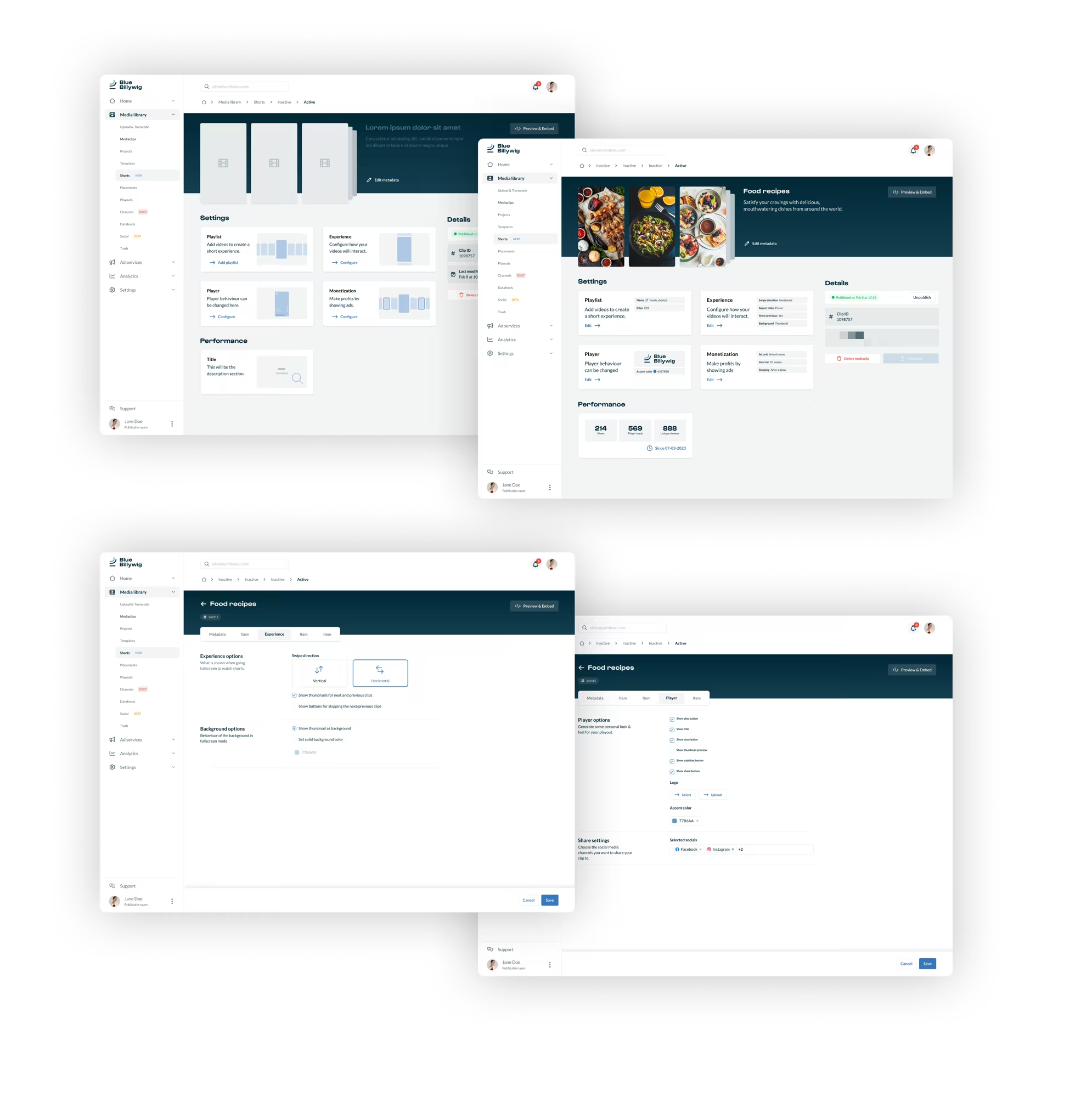
A feature of an online video platform that turns existing video into short, swipeable experiences: created and configured in the platform, and embedded on any page.
// My role
What I did, and with whom.
- Responsibilities
- Facilitating brainstorming sessions
- User research
- Wireframing and prototyping
- Mentoring a junior designer
- Team
- Stakeholders, product owners, a product manager, front-end and back-end developers and designers.
- Methods
- Design thinking
- Usability testing and interviews
- Wireframes
- Crazy 8s
- Agile and Scrum
// The problem
Short video from the library people already have.
Shorts is a feature of an online video platform that turns existing video into short-form experiences. It covers two sides of one product: how a customer creates and configures a short, and how a viewer plays it.
Short-form video has become one of the most popular kinds of social media content. For the customers of the platform it raised a practical question: how do you turn the video you already have into short, vertical experiences, without starting again?
The answer had to live inside the platform. Customers upload content and organise it into playlists. From those playlists a short is created, configured to fit their brand and embedded on their own pages, in three display formats and with more than twenty settings to tailor it.
// The thinking
Design the creator and the viewer together.
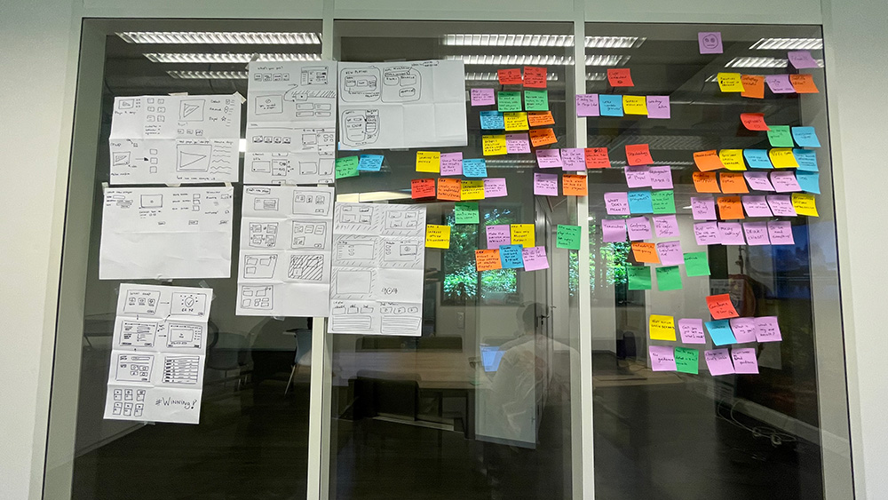
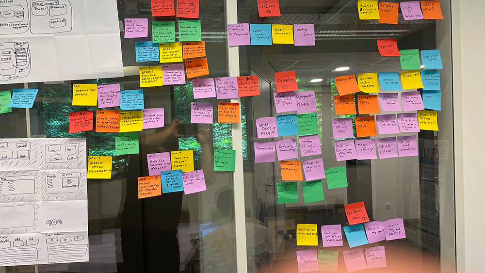
The work followed the design thinking method and started with brainstorm sessions: sketching with Crazy 8s, clustering notes and drawing first wireframes on paper before anything was designed in Figma.
Two things had to be solved at once. A customer needed a clear way to create and configure a short, with a lot of options. A viewer needed a player that feels natural on a phone as well as on a desktop, in whichever format was chosen.
What had to be designed
- CreationA guided way to make a short from existing content, with an empty state for customers who have none yet.
- ConfigurationMore than twenty settings, organised so that each one is easy to find.
- PlaybackA player with its own states on desktop and mobile: subtitles, seeking, sharing and ads.
- DistributionShorts that can be embedded on pages outside the platform.
// Key decisions
Four design responses, and what each one came from.
- 01
Settings grouped by what they change
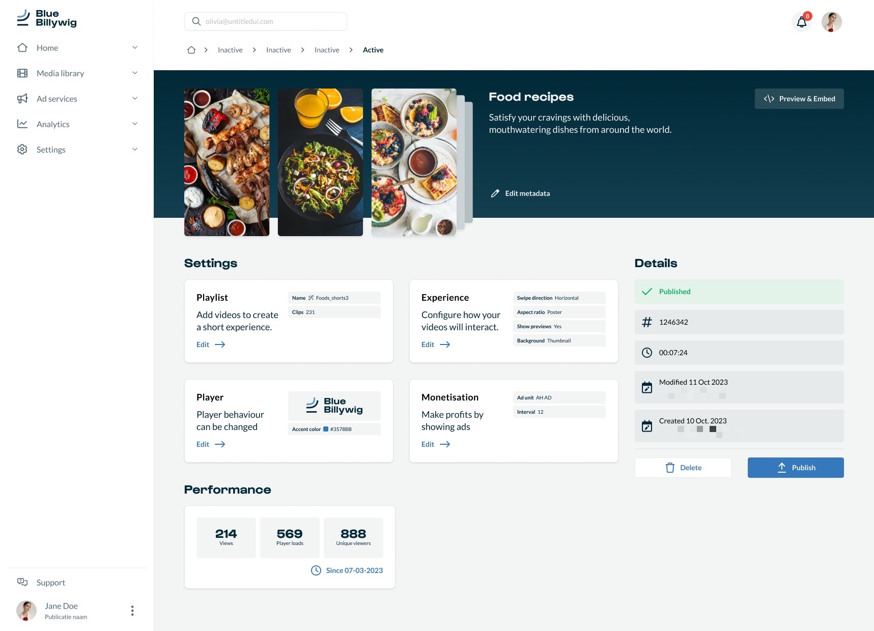
The configuration is split into four blocks: playlist, experience, player and monetisation, with performance shown beside them.
- Why
- With more than twenty options, a long list would be unusable. Grouping by what a setting changes lets a customer go straight to the part they need.
- 02
A page that looks like the rest of the platform
The overview of a short reuses the pattern of the media clip page: a header with the content, blocks with settings and a details panel with publishing.
- Why
- Familiar patterns keep the platform consistent. The goal was a page that stays recognisable next to the media library, while it shows a series of videos instead of one.
- 03
Experience options you can see
Choices such as swipe direction, previews and the background of the fullscreen view are presented as visual options with a short explanation, and saved per step.
- Why
- These settings change what a viewer sees. A visual choice is quicker to understand than a label, and the creator can judge the result before saving.
- 04
Player states designed, not left to chance
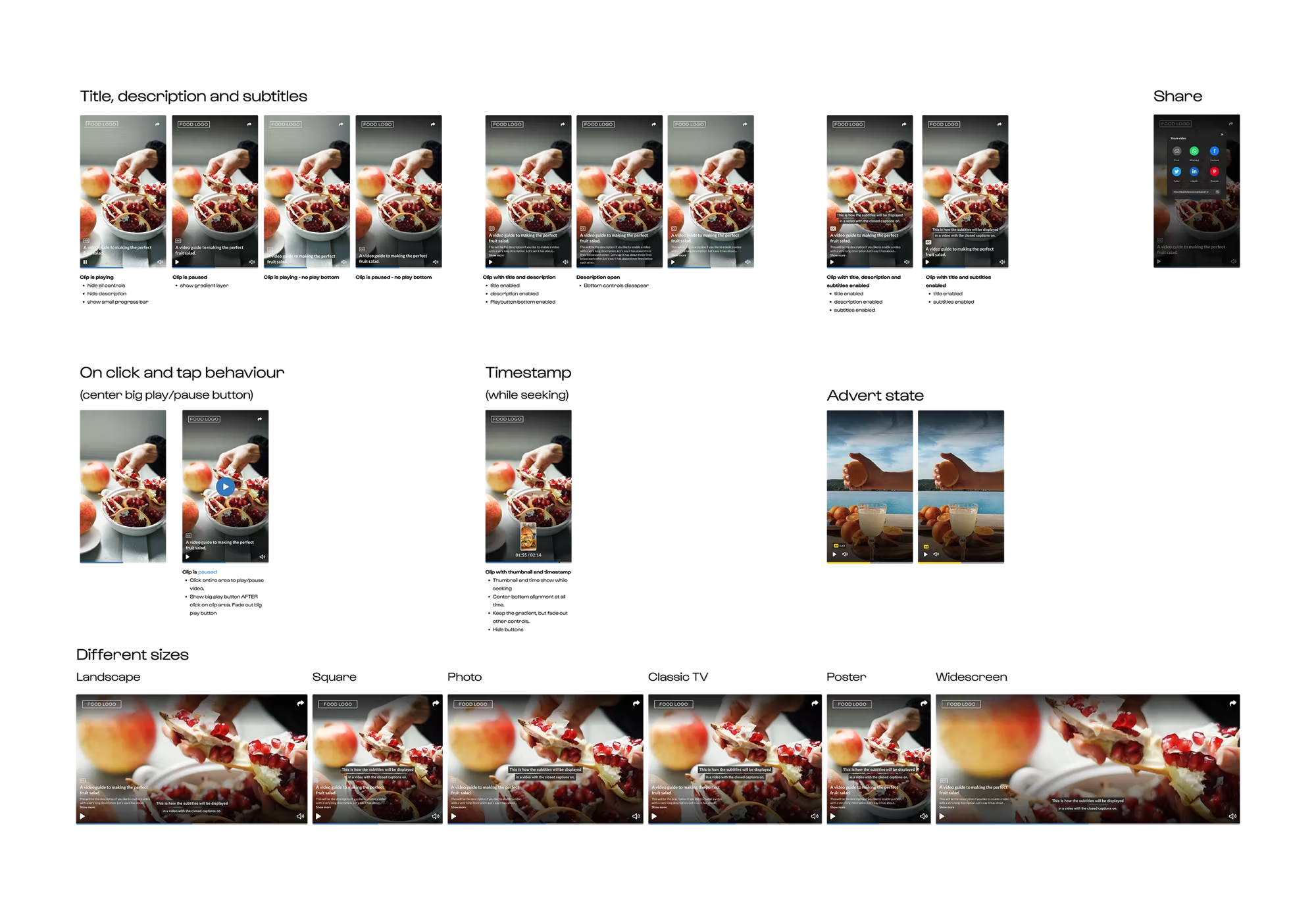
The player was drawn state by state for desktop and mobile: title, description and subtitles, behaviour on click and tap, the timestamp while seeking, sharing, ad slates and several video sizes.
- Why
- A short is watched on many devices and in several formats. Designing the states explicitly makes the player behave well whichever format a customer chooses.
// The intervention
One feature, built from creation to playback.
Wireframes came first, as simplified blueprints of the creation flow, the empty state and the fullscreen player. The designs were then built in Figma on the platform's design system, with the creation and configuration screens designed together with the viewer's player.
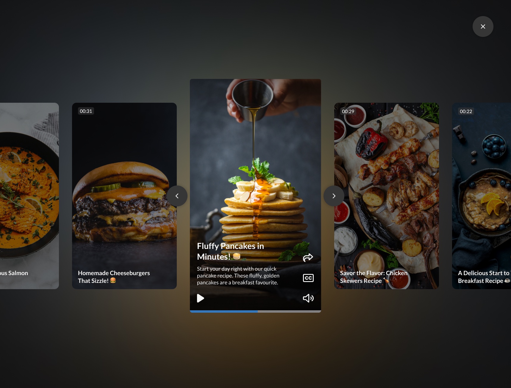
The result is a complete Shorts experience: a customer creates a short from a playlist, configures how it looks and behaves, previews it and embeds it. A viewer swipes through the clips, on desktop or on a phone.

// Outcome
A feature with more than twenty settings only works if each setting is easy to find, and if the result is easy to see.
The project delivered player states for desktop and mobile, support for various video formats and a complete Shorts creation experience in the redesigned platform. It is fully responsive and Shorts can be embedded on external pages.
No usage or business metrics are published for this project, so none are claimed here.
What I learned
- Reusing familiar patterns keeps a new feature consistent with the platform.
- Headers can differ in content, but should look and feel the same across menus.
- Keeping the media library and the Shorts page visually consistent, yet recognisable as different things, was the hardest balance.
- Splitting the configuration options logically was the most rewarding part.
// Contact
Have a complex product problem? Let’s make it clear.
- Emailhello@denizign.nl
- ProfileLinkedIn (opens in a new tab)